Gerald Burns Pharmacy

Gerald Burns Pharmacy

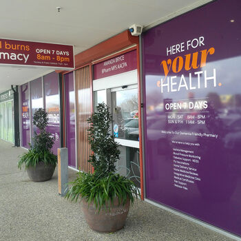
This sign design project was a refresh of the Pharmacy's exteriors and interior plaza entrance wall graphics Moja designed. The brief again was bright and colourful, so we set to work and created a design that was less typical for a pharmacy (no people photos) and more aligned to a stylish service orientated health destination that would appeal to the local clientele.

Read more

Shire of Kojonup Strategic Plan Booklet

Shire of Kojonup Strategic Plan Booklet

The Shire of Kojonup required a design that would reflect the community values and the Shire's future goals for The Shire of Kojonup Strategic Community Plan 2017 to 2027. The booklet aptly named 'Smart Possibilities' identifies with the community, and within the 32-page report visually communicates the strategic plan for the next decade.

Read more

Realestate 88 Website Design

Realestate 88 Website Design

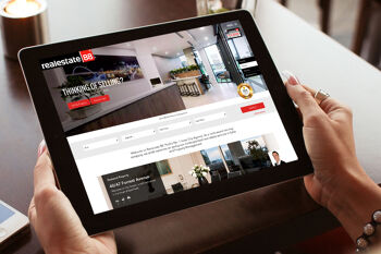
Realestate88 is a multi-award-winning real estate agency in Perth. They needed a website to showcase their reputable brand along with an easy to navigate website to view and enquire on the available property including inner-city new developments. The website required custom development to integrate with their sales software to automate and push content to the website for a continuous up-to-date website.

Read more

Unity Energy & Resources branding and website

Unity Energy & Resources branding and website

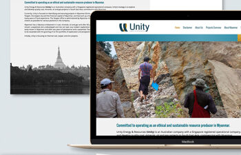
Unity Energy and Resources is a resources company with offices in Perth, Singapore and Myanmar. The logo mark on company vehicles in Myanmar has provided strong brand awareness in the region in a short period of time. We developed the logo, corporate business materials, office signs, vehicle graphics and website to form a strong foundation for an up and coming mining company.

Read more

envirochoice logo for sustainable packaging solutions

envirochoice logo for sustainable packaging solutions

An easy to identify icon was required to brand a range of compostable, biodegradable and recycled packaging. The logo was used to promote the sustainable qualities and was used on individual products, outer packaging and shipping cartons. The brief was to design a simple mark for plain packaging that would identify the item as environmentally friendly. The solution was a simple tab-like design, printed in a single colour for an understated and cost effective mark.

Read more